


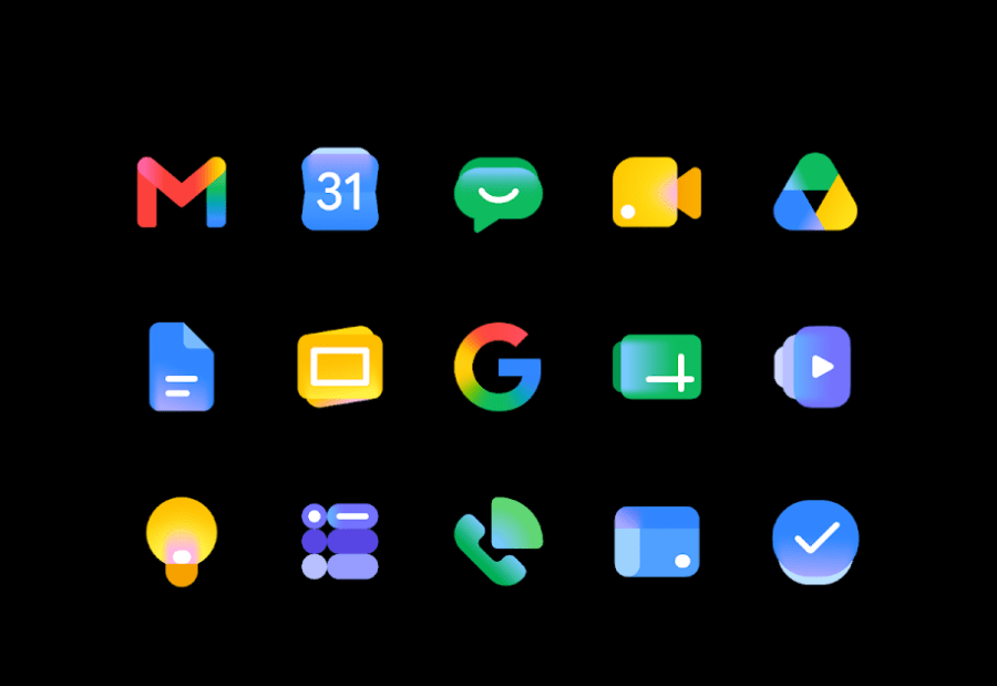
Google has shared new details about the redesigned icons for its Workspace applications, describing the update as part of a broader effort to align its products with the growing role of AI across the Workspace ecosystem.
Although the new icons were visible throughout Google I/O 2026, the company did not discuss the changes during its keynote presentation. Google has since explained that the redesign introduces a “fresh visual identity” for Workspace apps, reflecting what it calls the “Gemini Era.”
According to Google, the updated icons feature a more modern and streamlined appearance designed to make each application easier to recognize while maintaining consistency across the Workspace portfolio.
The company said the redesign provides every app with a more distinct identity while creating greater cohesion throughout the product suite.
“These changes drive consistency and cohesion across our product suite, while ensuring each individual application remains modern and recognizable on your screen.”
The refreshed design comes as Google continues expanding Gemini-powered AI features across Workspace. During Google I/O 2026, the company introduced new capabilities such as Gmail Live, Docs Live and a voice feature for Google Keep, further integrating AI into everyday productivity tools.
Several Workspace applications have received notable visual changes. Apps including Docs, Sheets, Slides, Keep, Forms, Sites and Vids no longer use the traditional paper-shaped background design. Meanwhile, Calendar, Meet and Chat have moved away from their previous box-like appearance in favor of more distinctive icon shapes.
Google has also relaxed its earlier design approach that required icons to prominently feature all 4 Google colors. Under the new system, Gmail remains the primary exception retaining the familiar multicolored design.
The company emphasized that the visual refresh affects only the appearance of the icons and does not introduce any changes to functionality, settings or administrative controls.
The updated icons will be rolled out over the coming weeks across Workspace applications, including Gmail, Calendar, Chat, Meet, Drive, Docs, Slides, Sheets, Vids, Keep, Forms, Voice, Sites and Tasks.
The redesign reflects Google’s broader strategy of evolving its product ecosystem around AI-powered experiences while ensuring that its productivity applications remain visually modern and easily identifiable for users.
Also read: Viksit Workforce for a Viksit Bharat
Do Follow: The Mainstream LinkedIn | The Mainstream Facebook | The Mainstream Youtube | The Mainstream Twitter
About us:
The Mainstream is a premier platform delivering the latest updates and informed perspectives across the technology business and cyber landscape. Built on research-driven, thought leadership and original intellectual property, The Mainstream also curates summits & conferences that convene decision makers to explore how technology reshapes industries and leadership. With a growing presence in India and globally across the Middle East, Africa, ASEAN, the USA, the UK and Australia, The Mainstream carries a vision to bring the latest happenings and insights to 8.2 billion people and to place technology at the centre of conversation for leaders navigating the future.