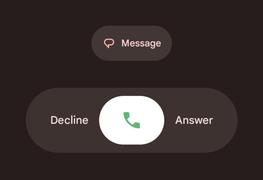
Android users have been surprised by a sudden change in their call and dialer screens without updating the app themselves. The reason is Google’s Material 3 Expressive Redesign, which is being quietly rolled out to the Phone app. While the update brings a fresh design and new navigation, it has sparked a wave of mixed reactions online. Some praise it as modern and cleaner, while others criticise it as oversized, distracting, and unnecessary.
The Phone app now looks very different. Favourites and Recents have been merged into a single Home tab that shows call history and top contacts in a carousel-style view. The Keypad sits in its own tab with larger round buttons replacing the old floating dialer. Contacts have been moved into a navigation drawer linked to the search bar. The incoming call screen has also changed, allowing users to answer or reject calls with a horizontal swipe, similar to iOS. There is an option to switch this back to the traditional single-tap setting. During a call, controls now appear as pill-shaped buttons, and the End Call button has been made larger and brighter, drawing much more attention than before.
What is bothering people most is not only the design itself but the way it was introduced. Many users say they never updated the app manually yet woke up to a completely different dialer. Familiar buttons now appear big and blocky, and the minimal design has been replaced with heavier visuals. Social media is full of strong reactions. One user said: “The phone app used to be perfection. Now the buttons are blocky, oversized, and ugly!” Another wrote: “What in the HUGE MESS IS THIS?! I’m not blind bruh!!” The large red End Call button has drawn particular criticism for being too loud and distracting.
Can it be changed back? Not fully. The swipe-to-answer feature can be switched off through Settings under Incoming Call Gestures, but there is no simple option to restore the old design. Some users are uninstalling the latest update to bring back the earlier version, although this is not a long-term solution. For now, the redesign appears permanent. Unless Google introduces a classic view mode, users will have to adapt. For some it feels like a clean improvement, while for others it is an unwanted change dropped in without warning. What is clear is that the Phone app, usually taken for granted, is now the focus of heated debate.
Also read: Viksit Workforce for a Viksit Bharat
Do Follow: The Mainstream formerly known as CIO News LinkedIn Account | The Mainstream formerly known as CIO News Facebook | The Mainstream formerly known as CIO News Youtube | The Mainstream formerly known as CIO News Twitter |The Mainstream formerly known as CIO News Whatsapp Channel | The Mainstream formerly known as CIO News Instagram
About us:
The Mainstream formerly known as CIO News is a premier platform dedicated to delivering latest news, updates, and insights from the tech industry. With its strong foundation of intellectual property and thought leadership, the platform is well-positioned to stay ahead of the curve and lead conversations about how technology shapes our world. From its early days as CIO News to its rebranding as The Mainstream on November 28, 2024, it has been expanding its global reach, targeting key markets in the Middle East & Africa, ASEAN, the USA, and the UK. The Mainstream is a vision to put technology at the center of every conversation, inspiring professionals and organizations to embrace the future of tech.


